Choosing the Right Meeting Room Layout for Your Team
This article covers six meeting room layout types, boardroom, U-shaped, theater, dynamic, hollow square, and classroom, and explains which configuration suits which kind of meeting. It replaces vague productivity stats with sourced research from Harvard Business Review, Microsoft, Steelcase, and a 2021 ergonomics study, and adds an honest section on when layout isn't the problem.


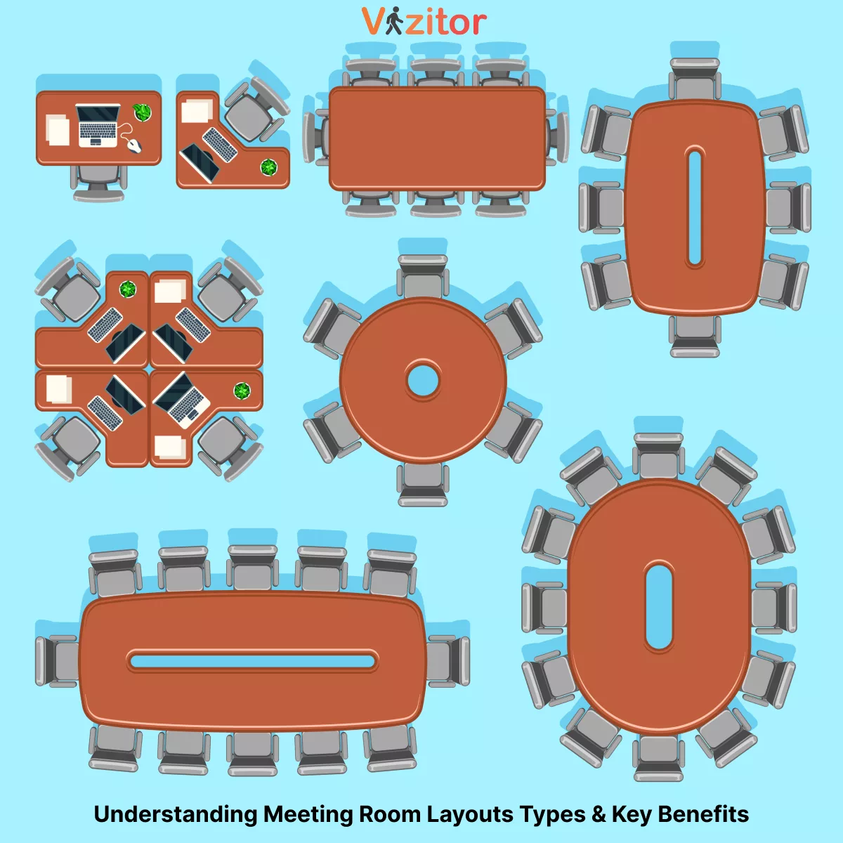
Table of Content
Try Vizitor for Free!
A meeting room layout is the physical arrangement of tables, chairs, and equipment inside a meeting space: boardroom-style, U-shaped, theater rows, or something more flexible. It matters because the wrong arrangement works against a meeting’s purpose before anyone says a word. A U-shape built for a workshop turns a formal negotiation into a free-for-all. Rows of theater seating turn a brainstorm into a lecture nobody asked for.
A 2017 Harvard Business Review study of senior managers found that 71% of them consider their meetings unproductive and inefficient, one of the most-cited numbers in meeting research since it was published (HBR, “Stop the Meeting Madness”). Poor room design is not the only reason meetings underdeliver, but it is one of the few causes a facilities or workplace team can fix directly, without touching anyone’s calendar or agenda.
This guide walks through six proven meeting room layouts, when each one earns its place, the mistakes that undercut good intentions, and one honest limit worth knowing before you rearrange any furniture: a great layout cannot rescue a meeting that never needed to happen.
Why meeting room layout matters
Layout is not decoration. It sets the terms for how a meeting actually runs.
Communication flow. Layout decides who can see and hear whom without straining. Rows facing forward suit information flowing one direction, from presenter to audience. A circle, U-shape, or square suits conversation flowing in every direction at once, which is why the two setups solve completely different problems.
Collaboration and engagement. A layout that puts people in each other’s line of sight invites them to speak up. One that has half the room staring at the backs of heads does the opposite, no matter how good the agenda is.
Space utilization. The same square footage can host a two-person call or a twelve-person workshop depending on how it’s arranged. Getting this wrong either wastes real estate or crams too many people into too little of it.
Professionalism. A deliberate, well-organized room signals that a company runs a tight operation before a single word is spoken, and pairing a good layout with creative conference room names reinforces that same impression before anyone sits down.
Choosing the right layout depends on the meeting’s objective, the number of participants, and how much interaction the session actually needs.
What to look for when choosing a meeting room layout
Selecting the right layout isn’t about aesthetics. It directly shapes engagement, communication, and how much gets decided in the time available. Five factors drive the decision.
What is the purpose of the meeting? A brainstorming session, a formal presentation, and a one-on-one review all need different physical setups, because each one asks the room to do a different job. Matching layout to purpose is the single biggest lever here; get this wrong and no amount of good furniture fixes it.
How many people will attend? A small team discussion works in an intimate round-table setup, while a large all-hands needs auditorium-style seating. It’s also worth sizing the guest list honestly. Microsoft’s 2023 Work Trend Index, a survey of 31,000 people across 31 countries, found that inefficient meetings are the single most commonly cited drain on workplace productivity (Microsoft WorkLab, Work Trend Index). A room stuffed with more people than the discussion actually needs is one of the easiest ways to create exactly that kind of meeting, and no layout fixes an invite list that’s too long for the room’s purpose.
What level of interaction is required? Collaborative meetings need interactive layouts like U-shape or hollow square. Presentation-based meetings work better with theater or classroom setups. Steelcase’s own workplace research notes that large, formal boardrooms can feel intimidating and tend to discourage people from speaking up, while smaller, more open layouts create a sense of comfort and equality that encourages participation (Steelcase, “Community Drives Performance”). If the goal is open discussion, the room’s formality is working against you before the meeting starts.
What technology and equipment does the room need? Projectors, whiteboards, and video conferencing tools all need proper placement so screens, microphones, and cameras support the conversation instead of getting in the way of it. A U-shape with the screen mounted behind half the attendees defeats its own purpose.
Is the space comfortable and accessible? Seating should be ergonomic and arranged for clear sightlines, with attention to lighting, ventilation, and accessibility for every participant. A 2021 study in the journal Applied Ergonomics tested 54 office workers under two seating conditions and found that seat comfort, combined with how well someone could concentrate, predicted whether they reached a focused, engaged state during their tasks (PubMed, Applied Ergonomics 2021). Uncomfortable seating isn’t a minor irritation in a two-hour meeting. It’s measurably working against the outcome the meeting was called for.
Also explore: Workplace Design Tips for Maximizing Space and Productivity
Best meeting room layouts and when to use them
Before picking a specific layout, look at the room-size problem first. Steelcase’s workplace research found that large conference rooms account for nearly 60% of all office meeting space, even though 80% of meetings involve only one to three people (Steelcase, “Community Drives Performance”). That mismatch is worth fixing before layout even enters the conversation, because the best boardroom setup in the world doesn’t help much if three people are rattling around a room built for eighteen.
With room size sorted, here are six layouts worth knowing, and where each one actually earns its place.
1. Boardroom style: best for high-level discussions
A boardroom layout puts a large rectangular or oval table at the center of the room, with chairs arranged around its full perimeter. It suits small to medium formal meetings, structured discussions, and decision-making sessions where everyone needs to face everyone else directly.
The format promotes a formal, structured environment and is well suited to executive or board meetings, where a handful of decision-makers sit around a central table. It also works for one-to-one meetings or small group discussions that need direct, face-to-face conversation. What it doesn’t do well is large-group brainstorming; the fixed, formal shape works against the open participation those sessions need.
2. U-shaped layout: perfect for interactive presentations
Tables arranged in a U-shape, with chairs along the outside edge and the open end left clear, define this layout. It’s built for workshops, interactive training, presentations, and collaborative sessions where a facilitator needs to move freely and engage the room.
The open end lets a speaker step into the discussion rather than stand apart from it, and every seat has a clear line of sight to the front. That combination is why training sessions and brainstorming meetings lean on this format so often. Adjustable seating adds flexibility for sessions that shift between presentation and discussion mode within the same hour.
3. Theater-style setup: ideal for large audiences
Rows of chairs facing a stage or presentation area define theater-style seating. It’s built for conferences, keynote speeches, and seminars where the goal is maximum seating capacity and every attendee’s attention pointed at one speaker.
This layout works best when there’s little need for interaction between participants and the primary job of the room is to let people listen or watch. It’s the wrong choice the moment a session needs discussion between attendees, since there’s no natural way for people in the same row to face each other.
4. Classroom-style: built for training and note-taking
Rows of tables, each paired with chairs, face the front of the room, giving classroom-style its name. It suits training sessions, certification courses, and any meeting where attendees need a flat surface for laptops, notebooks, or handouts instead of a bare chair.
It solves a real gap theater-style leaves open: nowhere to write. A software rollout training, a compliance briefing with paperwork to sign, or a multi-hour workshop where people are typing along all benefit from having a table in front of them. The tradeoff is space. Classroom-style eats up more square footage per attendee than theater rows do, so it’s a better fit for smaller, longer sessions than for large one-off presentations.
5. Dynamic or flexible layout: for creative and evolving sessions
This layout uses movable chairs, round tables, and open floor space that gets rearranged as the meeting’s needs change. It’s built for brainstorming sessions, creative workshops, and team-building activities where the room needs to shift shape mid-session.
Participants can rearrange seating and materials for different phases of the same meeting, moving from small breakout clusters to a full-group circle without leaving the room. It’s the right call for informal, fast-moving sessions, and the wrong call for anything that needs a fixed, formal arrangement, like a client presentation or a board vote.
6. Hollow square layout: for decision-making and group input
Seating arranged in a square with an open center, all participants facing inward, defines the hollow square. It suits interactive discussions, group decision-making, and activities where a central speaker or shared materials need to reach everyone equally.
Every seat faces every other seat, which promotes equality and open discussion better than a long boardroom table does. The open center allows materials or a facilitator to move freely and engage the whole group at once. It works well for strategy sessions and planning meetings where every participant’s input genuinely matters, and it’s overkill for a quick status update between two people.
Tips for maximizing space with the right layout
Choose modular furniture. Movable tables and chairs let one room adapt across several meeting types in a single day instead of being locked into one configuration.
Opt for a minimalist setup. Keep the room free of clutter by sticking to essential furniture and leaving room for people to move.
Use vertical space. Wall-mounted shelves and storage keep the floor area clear for seating and movement.
Go circular or oval where possible. Round and oval tables create a more collaborative feel and reduce the dead corners a rectangular table leaves unused.
Keep tech tools compact. Small, integrated technology, like a portable screen instead of a fixed projector rig, frees up floor space without sacrificing function.
Also explore: Best Practices for the Meeting Room Booking Process
Mistakes to avoid when choosing a meeting room layout
Not aligning the layout with the meeting’s purpose. Each layout serves a specific function. Picking one without considering whether the meeting is a brainstorm, a presentation, or a formal discussion is one of the common meeting room challenges offices run into repeatedly.
Forgetting about accessibility. A layout that doesn’t accommodate participants with physical disabilities, or that blocks clear pathways through the room, limits who can actually participate and comfortably stay for the full meeting.
Ignoring flexibility. Sticking with one static layout for every meeting type limits the room’s usefulness. Movable furniture lets the same space adapt to different sizes and formats instead of forcing every meeting into the same shape.
Disregarding visual clarity. A layout that keeps participants from facing one another, or from seeing the presenter, invites disengagement. Sightlines matter as much as seating count.
Placing technology as an afterthought. A screen mounted behind half the attendees, or a microphone that only reaches the front row, undoes the rest of a well-planned layout. Decide where the tech goes before finalizing where the furniture goes, not after.
When a layout won’t fix the problem
A good layout solves a specific problem: people who can’t see, hear, or engage with each other because of how the room is arranged. It doesn’t solve everything a bad meeting can suffer from, and it’s worth being honest about where the line sits.
If rooms are double-booked, sitting empty while marked “occupied,” or impossible to find on short notice, that’s a scheduling problem, not a layout problem. Our guide to fixing a broken meeting room booking process and our breakdown of choosing meeting room booking software both cover that side of the equation directly. Rearranging chairs won’t stop two teams from claiming the same room at the same time.
Layout also stops mattering much below a certain group size. A two-to-four person huddle call rarely needs a formal layout decision at all; any small table with a screen does the job, and the six configurations above are built for rooms that need to seat a real group with a specific interaction pattern in mind.
Wrap up
Perfecting meeting room layouts is one of the more affordable design decisions a workplace can make, and it pays off every time the room gets used. With Vizitor’s meeting room booking system, teams can track which layouts and room sizes actually get booked, so the next renovation or reconfiguration is based on real usage data instead of a guess.
Explore more on mastering workplace design, and see how Vizitor’s meeting room booking tools can pair scheduling with the right physical setup for enhanced efficiency and employee satisfaction. If you’re still comparing platforms, our guide to picking the right meeting room booking software covers the criteria worth checking before you commit.
Ready to get more out of your meeting spaces? Book a Vizitor demo and see how booking data and room layout decisions work together.
Frequently Asked Questions
See Vizitor in action check-in a visitor in under 30 seconds
Trusted by 500+ businesses. QR check-in, badge printing, NDA signing. Plans from $36/mo.