Early Signals of Burnout and Attrition Hidden in Attendance Records
Your attendance data quietly records early signals of burnout, disengagement, and coming resignations, but most managers miss them because they read attendance as a monthly compliance number instead of a live diagnostic. The real signals sit at the individual and team level: shifting absence timing, creeping tardiness, overtime piling on a few names, and sudden changes in routine. Read those patterns while they are still forming and you can act with a conversation before a good employee becomes a vacancy. Vizitor gives you the clean, real time capture and reporting that makes those patterns visible, with a 10-day free trial.



Table of Content
Try Vizitor for Free!
The report on your desk is lying by omission
Most companies look at attendance once a month. Someone pulls a summary, notes the overall absence rate, flags anyone who crossed a threshold, and files it. The number looks fine, so everyone moves on.
The problem is that a monthly average is very good at hiding the things you actually need to know. An absence rate of three percent across a fifty person team can sit comfortably in the “healthy” zone while one department quietly falls apart and two of your best performers drift toward the exit. The average absorbs all of it. Nothing looks wrong until someone resigns, and then it looks obvious in hindsight.
Attendance data is one of the earliest behavioral signals you have. People change how they show up before they change what they say in a one on one. A study tracking employees across dozens of companies found that burnout was the single strongest behavioral predictor of unplanned absence, ranking ahead of commute time, pay satisfaction, and even job fit. In other words, the way people arrive at work often tells you more than an engagement survey does, and it tells you sooner.
The data is already sitting in your system. The gap is in how it gets read.
Why managers read attendance data wrong
There are three habits that quietly waste the most useful dataset in your building.
The first is the compliance mindset. Attendance gets treated as a payroll input and a policy enforcement tool. Did they clock in, did they clock out, do we deduct anything. That framing answers a legal and financial question, but it never asks the human one, which is why the pattern is happening at all.
The second is timing. Many teams still report attendance monthly or quarterly. By the time a summary lands, the moment to respond has passed. A dip you could have addressed with a conversation in week one becomes a resignation letter in week six. Real value comes from spotting a trend while it is still forming, not confirming it after the fact.
The third is aggregation. A single company wide absence rate flattens everything interesting. The signals live in the segments: which team, which shift, which days of the week, which individuals, and how those patterns are changing over time. When you only look at the headline figure, you are averaging away the exact information that would let you act.
Managers are not being careless. They were handed a number and told to watch it. The number just was not designed to answer the questions that matter.
The six signals hiding in your attendance records
Here is what your raw attendance log is actually saying, if you segment it and watch it move.
1. The Monday and Friday pattern
When absences cluster around the start and end of the week, something structural is usually going on. Analysis of workforce data has repeatedly found that Monday and Friday call outs spike more than any other days, and that clustering often points to burnout, scheduling fatigue, or work life balance strain rather than genuine one off illness.
A manager reading a monthly total sees “acceptable absence rate.” A manager reading the timing sees a team that is running on empty by Thursday and buying itself a long weekend to recover. Those are two completely different problems, and only one of them shows up in the summary. The fix is rarely a stricter policy. It is usually a workload or scheduling conversation.
2. The slow creep of tardiness
Lateness feels minor, so it gets excused. Five minutes here, ten minutes there, nothing worth a formal note. But a steady rise in tardiness for a specific person, especially someone who used to be reliably early, is one of the earliest indicators of quiet disengagement. It often shows up weeks before absence does.
The signal is not the lateness itself. It is the change in the baseline. A person who was consistent for a year and is now drifting later most mornings is telling you something has shifted, whether that is motivation, a personal situation, or a growing sense that showing up on time no longer matters. Caught early, it is a supportive check in. Caught late, it is a performance review that neither of you wanted. On the employee side of this same pattern, our punctuality tips for individuals and managers breaks down why most people misdiagnose their own lateness as a discipline problem instead of a measurement one.
3. The overtime trap
Overtime is easy to celebrate. The team hit the deadline, someone stayed late, output looked great. But consistent overtime concentrated on a few names is one of the clearest predictors of burnout, and burnout tends to hit your strongest performers first because they are the ones you keep leaning on.
Attendance and time data show you exactly who is absorbing the extra hours. If the same three people are always the ones staying past closing, you do not have a productivity win. You have a workload distribution problem and a retention risk building quietly inside your best talent. The data names the people at risk long before they name themselves.
4. The sudden silence
One of the most reliable pre resignation signals is a change in routine that goes the other way. An employee who suddenly stops taking any leave, tightens their hours to the exact minimum, and pulls back from the flexible give and take they used to show is often mentally halfway out the door. So is the opposite pattern, a rise in single day absences that never quite forms a clear reason.
Machine driven models that predict attrition lean heavily on shifts in attendance rhythm for this reason, and workforce research suggests these approaches can meaningfully improve how early at risk employees are identified compared with relying on manager observation alone. You do not need a data science team to catch the obvious version of it. You need someone actually watching the individual pattern instead of the group average.
5. The department cluster
Sometimes the problem is not a person. It is a place on the org chart. When absences and lateness cluster inside one team or under one manager while the rest of the company stays steady, the data is pointing at something environmental: workload imbalance, a scheduling issue, a difficult dynamic, or a manager who needs support.
This is the signal companies miss most often, because they look at attendance employee by employee and never step back to see the shape. A sudden spike inside a single department rarely means five people independently got less committed in the same month. It usually means the conditions in that corner of the business changed. Fix the conditions and the attendance recovers on its own.
6. The ghost hours
Not every signal is about wellbeing. Some are about data integrity. When your records show clock ins that do not match reality, hours logged for people who were not on site, or suspiciously identical entries across a team, you have a trust and accuracy problem. Manual sheets and honor system logging make this almost inevitable, and it quietly corrupts every other insight you try to draw.
If you cannot trust the raw record, you cannot read any of the patterns above with confidence. Clean, verified capture is the foundation. Everything else is built on top of it.
Why raw records keep failing you
If these signals are so useful, why do so few teams act on them. The honest answer is that most attendance data lives in a form that makes reading it painful.
Spreadsheets are static. They tell you what happened last month, not what is happening today, and they do not raise a hand when a pattern starts to form. Data trapped in disconnected systems is worse, because the timing lives in one place, the leave requests in another, and the occupancy picture nowhere at all. Nobody has the full view, so nobody sees the trend until it becomes an incident.
Then there is the trust issue from the ghost hours signal. Predictive systems generally need a few months of clean, consistent data before their patterns mean anything. If your capture method is manual and error prone, you are trying to read tea leaves in muddy water.
Reading attendance as a live diagnostic requires three things that most setups lack: capture you can trust, a view that updates in real time, and reporting that surfaces the segment level patterns instead of burying them in an average.
A simple framework for reading attendance data
You do not need a complicated model to start turning attendance into early warnings. You need a repeatable habit. Here is a five step loop that works for teams of almost any size.
Start by spotting the pattern, not the number. Look for change over time in a specific person or team, not the company wide rate. A moving baseline is the signal.
Then segment it. Break the data down by team, shift, day of week, and individual. Ask where the pattern concentrates. This is where the compliance report gives up and the real picture begins.
Next, correlate it. Line the attendance shift up against context you already have. Did overtime spike right before the absences started. Did the pattern begin when a project or a manager changed. Attendance rarely moves for no reason.
Then have the conversation. Data tells you where to look, not why it is happening. The most valuable step, and the one most companies skip, is taking what the pattern shows you into a direct, supportive conversation with the person or the line manager. The record starts the discussion. It does not replace it.
Finally, act and watch. Make one change, whether that is redistributing workload, adjusting a schedule, or offering support, then keep watching the same pattern to see if it responds. Reading attendance data well is a loop, not a one time report.
What this looks like with Vizitor
The framework above only works if the underlying data is clean and current. That is the layer Vizitor is built to give you.
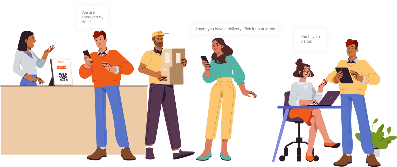
Vizitor captures attendance through QR and GPS enabled check in, designed to be touchless and cloud based, which removes most of the manual entry errors that create ghost hours in the first place. Because it runs in real time, you get a live view of who is on site and current occupancy rather than a month old snapshot. Its analytics and reporting are built to surface operational patterns and generate instant reports, so the segment level view, by team, by day, by shift, becomes something you can actually see instead of something you have to build by hand in a spreadsheet.
It also connects to the tools your team already uses, including Google Workspace, Slack, and Microsoft Teams, so attendance signals live alongside the rest of your workday instead of in an isolated silo.
To be clear about what the tool does and does not do: Vizitor gives you trustworthy capture, a real time picture, and reporting that makes patterns visible. The interpretation and the human conversation are still yours to lead. That is exactly how it should be. Software should make the signal obvious. A good manager still has to act on it.
You can try all of it on a 10-day free trial, and see what your own attendance data has been trying to tell you.
The bottom line
Your attendance data has been talking the whole time. The Monday spikes, the creeping lateness, the same three names always logging overtime, the quiet person who suddenly stopped taking any leave. Every one of those is a sentence in a story about how your people are really doing, and most of it never reaches the manager who could do something about it, because it gets flattened into a single monthly number and filed away.
You do not need a data science team to change that. You need clean capture you can trust, a view that updates while the pattern is still forming, and the discipline to segment the data and take what you find into a real conversation. Do that, and attendance stops being a compliance chore and becomes one of the earliest, most honest signals you have about the health of your workforce.
Vizitor gives you that foundation: touchless QR and GPS check in, a real time picture of who is on site, and reporting that makes the patterns visible instead of hidden. Start your 10-day free trial, and read what your data has been telling you all along. Prefer to see it walked through on your own numbers first? Book a demo and we will show you exactly where to look.
Frequently Asked Questions
See Vizitor in action check-in a visitor in under 30 seconds
Trusted by 500+ businesses. QR check-in, badge printing, NDA signing. Plans from $36/mo.