The Facility Metrics That Actually Belong on Your Dashboard
This article names the 10 specific metrics a facility manager's dashboard should track: visitor check-in time, peak visitor hours, average queue wait time, queue abandonment rate, desk utilization rate, desk booking no-show rate, meeting room utilization rate, meeting room no-show rate, package processing time, and unclaimed package rate. It covers visitor management, queue management, desk booking, meeting room booking, and mailroom/delivery workflows, explaining what each number reveals operationally, why it's easy to miss without dedicated tracking, common mistakes teams make when building a facility dashboard, and when a metric doesn't apply to a given workplace. It closes with how Vizitor's space management software brings all five data sources into one connected view instead of five separate spreadsheets.



Table of Content
Try Vizitor for Free!
The 10 metrics every facility manager’s dashboard needs are: visitor check-in time, peak visitor hours, average queue wait time, queue abandonment rate, desk utilization rate, desk booking no-show rate, meeting room utilization rate, meeting room no-show rate, package processing time, and unclaimed package rate. Together, these ten numbers cover the five areas a modern workplace actually runs on day to day: visitors, queues, desks, meeting rooms, and deliveries.
A dashboard built around these ten answers a question fast: is the front desk backed up right now, is a department drowning in no-shows, is a package sitting unclaimed since yesterday. Most dashboards fail that test not because they lack data, but because they show the wrong numbers, or show an average without the failure case sitting underneath it.
This is a working list, not a strategy piece. If you want the bigger case for why dashboards matter across an organization, Vizitor’s guide to workplace management dashboards covers that ground well. Here, the question is narrower and more practical: which specific numbers should be on a facility manager’s screen every morning, and why does each one matter operationally.
Vizitor’s space management software pulls from visitor, queue, desk, room, and delivery data in one place, which is why these ten metrics span all five areas instead of just one.
Why most facility dashboards get this wrong
Most dashboards default to whatever numbers are easiest to pull from the underlying system: total visitors, total bookings, total packages. Those are counts, not signals. A count tells you volume happened; it doesn’t tell you whether the process handling that volume is healthy.
The second common failure is showing an average with no companion metric. Average wait time looks reassuring right up until abandonment quietly climbs because people are leaving before they’re counted in that average at all. Average desk utilization looks healthy right up until no-shows are hiding the real number underneath it. A metric in isolation tends to flatter the process; a metric paired with its failure case tells the truth.
The third failure is building one dashboard for every location and every role. A facility manager, a receptionist, and a regional operations lead don’t need the same view, and forcing them to share one usually means nobody gets a screen that actually answers their specific question fast. A receptionist needs live queue and check-in numbers in front of them; a regional lead needs utilization and no-show trends across sites, not a real-time feed of individual visitors. The same ten metrics can power both views, just filtered and framed differently for who’s actually looking at the screen.
Visitor metrics: what’s happening at the front door
1. Visitor check-in time
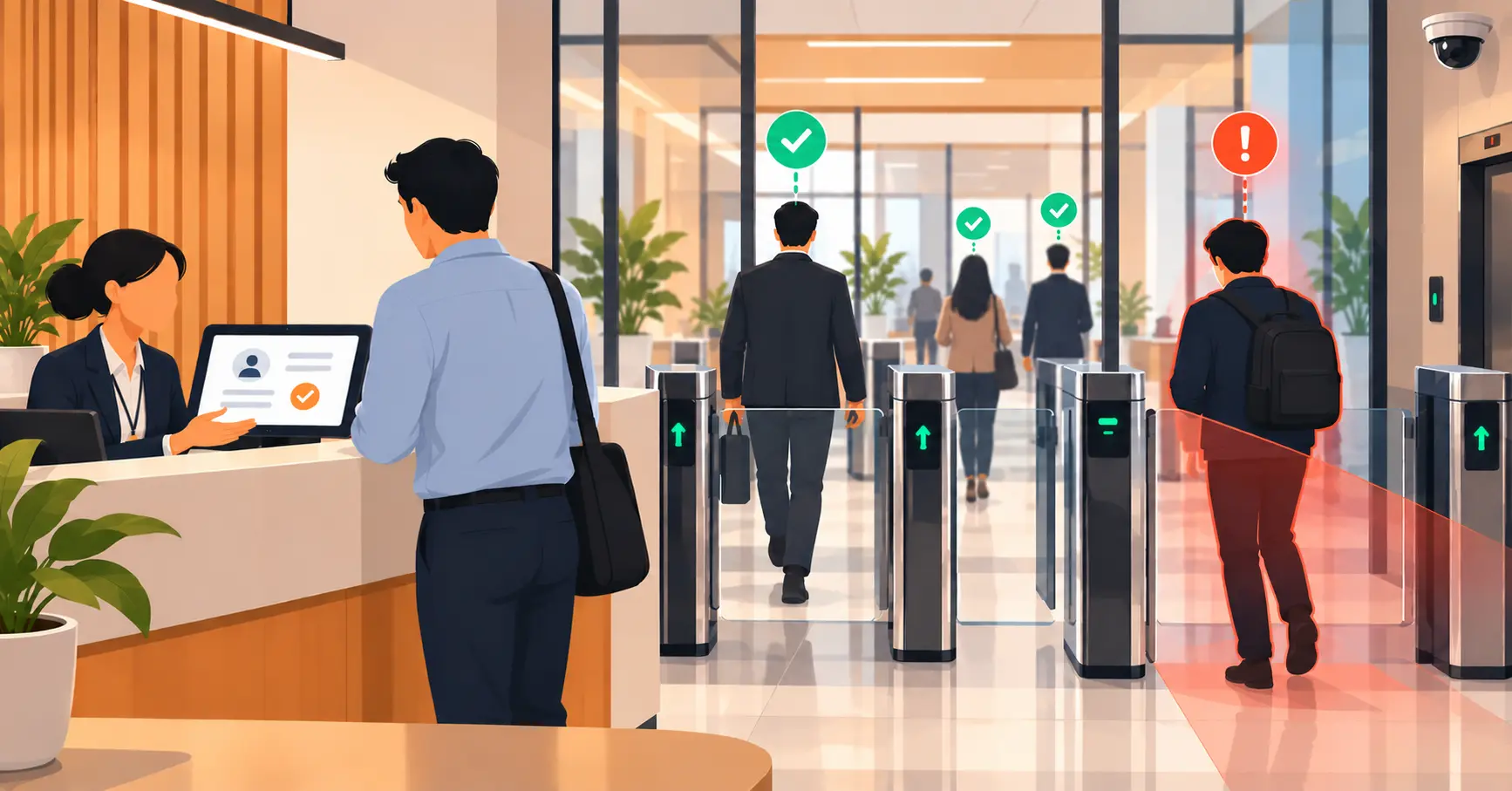
This is the gap between a visitor walking in and being checked in, badged, and pointed toward their host. A slow check-in process backs up the lobby and makes every other number on the dashboard worse, because a crowded lobby produces distracted staff and rushed decisions.
Track this as an average, but watch the outliers more closely than the mean. A five-minute average with occasional 20-minute waits during peak hours tells you more than the average alone. If you only ever look at the average, a bad first impression for one in ten visitors stays invisible.
2. Peak visitor hours
Knowing when visitor volume spikes lets you staff reception properly instead of reacting to a backed-up lobby after it’s already happened. Most offices have a predictable pattern: heavy at opening, a lunchtime bump, another wave before end-of-day meetings. A dashboard that shows this by hour, not just by day, is the one that actually changes staffing decisions.
This metric also feeds back into the first one. A facility that only tracks average check-in time without peak-hour context will misread a perfectly reasonable slowdown during a known rush as a process failure, when the real fix is simply staffing that hour differently.
Queue metrics: what’s happening while people wait
3. Average queue wait time
This is the standard queue metric, and it earns its place because it’s the number stakeholders ask about first. But it only tells half the story on its own; pair it with the next metric, because a falling average wait time can quietly mask a rising abandonment rate if people are leaving before they’re ever served.
4. Queue abandonment rate
People who leave before being served don’t show up in your wait-time average, but they represent a real cost: a lost sale, a frustrated vendor, a candidate who walked out of an interview queue. If your dashboard only tracks completed visits, abandonment is invisible by definition, since the people who left were never counted as a completed transaction to begin with.
For a deeper look at how appointment and walk-in queues should be routed in the first place, so abandonment doesn’t happen for avoidable reasons like unclear routing, see Vizitor’s guide to appointment queue management. If queue performance is the metric you actually own, our full breakdown of the 8 queue KPIs worth tracking goes deeper, with the formula, a benchmark, and a worked example for each one.
Desk metrics: what’s happening with hybrid seating
5. Desk utilization rate
The percentage of available desks actually booked and used, not just booked. A desk reserved but never occupied is a different problem than a desk that’s genuinely full, and a dashboard that conflates the two will produce the wrong space-planning decision, like leasing more space when the real issue is unused reservations.
6. Desk booking no-show rate
Booked-but-unused desks quietly waste capacity, especially in a hybrid office where a hoarded but empty desk blocks someone who actually needed it that day. This is the metric that explains a confusing gap between “desks are fully booked” and “the office looks half empty.” Vizitor’s hot desking ROI guide goes deeper into why this number matters for the business case behind desk booking software.
Meeting room metrics: what’s happening with shared spaces
7. Meeting room utilization rate
How much of the available room-hours are actually booked and used. Low utilization on paper doesn’t always mean rooms are free; it can mean the booking process is broken and people are grabbing rooms informally instead of reserving them, which makes the utilization number look lower than the real demand for space.
8. Meeting room no-show rate
A room that shows as booked but sits empty blocks a colleague who needed it and skews every utilization number above it. If this rate is high, the fix usually isn’t more rooms; it’s a policy that releases unclaimed bookings after a grace period so the room becomes available again automatically.
Delivery and mailroom metrics: what’s happening with packages
9. Package processing time
The time between a package arriving at the mailroom and the recipient being notified. A long gap here is usually invisible until someone complains about a missing package that was actually sitting in the mailroom the whole time, undermining trust in the mailroom process even though nothing was technically lost.
10. Unclaimed package rate
Packages that sit for days without pickup take up physical space and create the exact disputes that make facility teams look disorganized, even when the delay is the recipient’s fault, not the process. Tracking this number turns “we think packages pile up” into a specific, fixable count. Vizitor’s guide to package notifications covers how automated alerts reduce this number in practice.
How these ten metrics connect to each other
None of these numbers should be read alone. A healthy-looking average queue wait time next to a climbing abandonment rate means people are leaving, not being served faster. A high desk utilization rate next to a high no-show rate means the office looks full on paper but isn’t full in practice. A short average package processing time next to a rising unclaimed rate means the mailroom is doing its job and the bottleneck has moved to the recipient’s side.
The pattern across all five areas is the same: an average tells you what typically happens, and its paired metric tells you what’s failing underneath that average. A dashboard that only shows the first half of each pair will always look calmer than the workplace actually is.
A hypothetical morning check, illustrated
The numbers below are illustrative only, not pulled from a real Vizitor customer, but they show how the ten metrics work together in practice.
Imagine a facility manager opens the dashboard at 9 a.m. Visitor check-in time looks fine at just under two minutes on average, but peak visitor hours show a cluster between 9:30 and 10:15, right when three scheduled interviews and a vendor delivery are due to arrive at once. That’s a staffing note, not a crisis.
Queue wait time is trending flat, but queue abandonment ticked up the previous afternoon. Cross-checked against peak hours, both numbers point to the same window: reception was overwhelmed for about 45 minutes and some walk-ins left before being served.
Desk utilization reads high at first glance, until the no-show rate for the same day shows a third of “booked” desks were never actually occupied. The office isn’t full; it’s over-reserved.
Meeting rooms look calm. Packages do not: the unclaimed rate has been climbing for three days in one building, even though processing time is fast. The bottleneck isn’t the mailroom, it’s pickup.
None of these five observations required a spreadsheet export. That’s the difference a connected dashboard makes over five disconnected ones.
Common mistakes when building a facility dashboard
The first mistake is tracking totals instead of rates. A count of “500 visitors this week” says nothing about whether check-in was fast or slow. A rate or a time-based metric says something a manager can act on.
The second mistake is treating every location the same. A single-site office with scheduled visits only needs a fraction of this list. A multi-site operation with heavy walk-in traffic, dense hybrid seating, and high package volume needs most of it, and probably needs it broken out by location rather than blended into one company-wide number that hides which site actually has the problem.
The third mistake is building the dashboard once and never revisiting it. The metrics that mattered when an office was mostly empty during a slow return-to-office period aren’t the same ones that matter once occupancy climbs back toward capacity.
The fourth mistake is leaving every metric unowned. A number with no one responsible for reacting to it just becomes wallpaper. Queue abandonment should have a name attached, usually whoever manages front-desk staffing. Unclaimed packages should have a name attached, usually whoever runs the mailroom. A dashboard without owners turns into a report nobody reads.
When this list doesn’t fully apply
Not every workplace needs all ten metrics, and forcing all of them onto a dashboard that doesn’t need them just adds noise. A single-location office with scheduled-only visits and no walk-in traffic can drop queue metrics almost entirely. A site with no bookable meeting rooms doesn’t need room utilization. A workplace without a staffed mailroom can skip the package metrics and rely on simpler delivery logging instead.
Worth saying plainly: a dashboard shows you where the problem is, it doesn’t solve the problem. High queue abandonment might mean you need better routing, not just a routing metric. High desk no-shows might need a policy change, not just visibility into no-shows. Treat every metric on this list as a starting point for a conversation with the team that owns that workflow, not a final verdict on its own.
Building this without ten separate systems
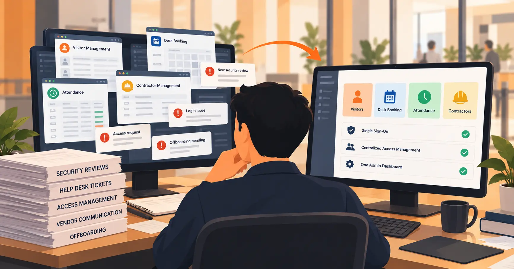
The hard part of tracking these ten metrics usually isn’t any single number, it’s that visitor data, queue data, desk data, room data, and delivery data typically live in five different tools that don’t talk to each other. A facility manager ends up exporting five spreadsheets to answer one question, and by the time all five are reconciled, the numbers are already a day old.
Vizitor’s space management software keeps these data sources connected, so a single dashboard view can span visitor check-ins, queue status, desk and room bookings, and delivery tracking without manual reconciliation.
Put these numbers in one place
Chasing ten metrics across five disconnected tools defeats the purpose of tracking them at all. Book a demo to see how Vizitor’s space management software brings visitor, queue, desk, room, and delivery data into one dashboard.
Frequently Asked Questions
See Vizitor in action check-in a visitor in under 30 seconds
Trusted by 500+ businesses. QR check-in, badge printing, NDA signing. Plans from $36/mo.